Ever feel like your home environment affects your mood? You’re not alone!
The colors on your walls and the way you arrange your space can have a surprising impact on your mental well-being. Did you know that certain colors can promote relaxation, creativity, or even feelings of optimism?
In this guide, we’ll explore the psychology of color and how different painting techniques can create a more calming and uplifting atmosphere in your home.
Foundations of Color Psychology
Color psychology is the study of how colors influence emotions and behaviors. Its foundations rest on the understanding that colors have the power to evoke specific psychological responses and carry diverse cultural meanings.
Emotional Responses to Color
Individual colors can trigger a range of emotional responses based on their perceived warmth or coolness. Cool colors, such as blue and green, have a calming effect, often used to reduce stress and promote relaxation.
Warm colors like red and orange, in contrast, can energize and stimulate but may also increase tension. For example, yellow is widely associated with happiness and optimism, making it a popular choice in environments aimed at creativity and upliftment.
Cultural Meanings of Colors
The significance of colors extends beyond universal emotional responses, incorporating cultural associations and symbolism. For instance, white often signifies purity and peace in Western cultures, while in some Eastern cultures, it represents mourning.
Understanding these cultural nuances is vital for applying color therapy effectively across different groups to ensure that the intended psychological benefits align with the cultural context.
Color Selection for Mental Well-being

Specific colors can evoke a range of psychological responses, contributing to an environment that promotes comfort, relaxation, or balance.
Warm Colors for Comfort
Reds, oranges, and yellows are traditionally considered warm colors. They can stimulate feelings of warmth and comfort in a living space, especially during colder seasons.
For example:
- Orange: Instills a sense of energy and enthusiasm.
- Yellow: Evokes happiness and can brighten spaces with its perceived sunshine-like quality.
| Color | Effect on Mood | Best for Rooms |
| Orange | Energizing | Activity spaces |
| Yellow | Uplifting | Kitchens, Nooks |
Cool Colors for Relaxation
Cool colors like blue and green help in crafting serene and restful environments. Their tranquil properties are ideal for spaces designed for relaxation and thoughtfulness.
Key cool tones include:
- Blue: Known for its calming effect, it’s often used in bedrooms and bathrooms.
- Green: Represents renewal and can ease stress in a home office or study.
| Color | Effect on Mood | Best for Rooms |
| Blue | Calming | Bedrooms, Bathrooms |
| Green | Stress-reducing | Home Offices and Studies |
Neutral Tones for Balance
Neutral tones such as beige, gray and white serve as the backbone for a balanced color palette. They offer flexibility and can be easily paired with accent colors.
Characteristics of neutrals include:
- Beige: Provides a warm yet understated backdrop for everyday living.
- Gray: Delivers a sophisticated, modern feel with versatile decorating possibilities.
| Color | Effect on Mood | Best for Rooms |
| Beige | Welcoming and versatile | Living rooms, Entryways |
| Gray | Modern and neutral | Any room |
Neutral tones work effectively as a canvas where other colors can be introduced to create a specific atmosphere while maintaining balance.
Space Design and Color Implementation
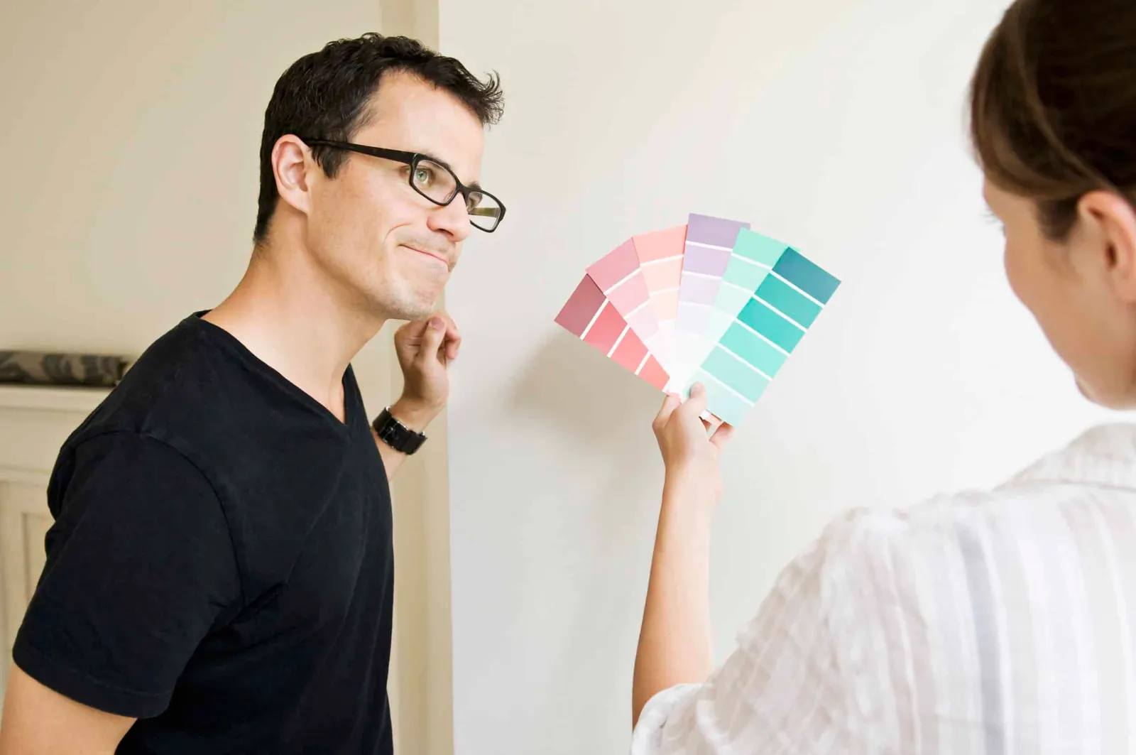
Strategic color implementation paired with lighting can transform a room’s atmosphere, influencing mood and cognitive functions.
Room Function and Color Theory
- Office Spaces: Cool tones like blues and greens are recommended for areas requiring concentration, as they are associated with calmness and efficiency.
- Bedrooms: Warmer, muted tones such as soft pinks or creamy yellows can create a restful environment conducive to relaxation and sleep.
- Living Areas: Energetic colors like oranges or yellows might be interspersed to inspire social interaction and liveliness.
In integrating color for therapeutic purposes, one must consider the primary function of the room to choose an appropriate palette based on color theory.
Lighting and Perceived Color
- Natural Light: It can greatly alter the perceived color of a space, making lighter shades appear more vibrant and creating the illusion of openness.
- Artificial Light: Warm lighting can enhance warm colors, whereas cool lighting can complement blues and greens.
A table illustrating the effect of different lighting on colors:
| Color | Natural Light | Warm Artificial Light | Cool Artificial Light |
| Blue | Brighter and Airier | Softer and More Welcoming | True to Tone |
| Green | Lively and Fresh | Cozy and Calm | Sharpened Contrast |
| Yellow | Enhanced Warmth | Intensified Warmth | Glowing Effect |
Lighting considerations are important as they not only affect how a color is perceived but also the resulting mood within the space. When planning color and lighting, one must assess the quality of light the room receives and the atmosphere intended to be created.
If you would like help building a palette for your own home, book a color consultation or get in touch.
Frequently asked questions
Which colors are best for a calming home?
Palettes drawn from nature tend to read as calm and restorative: muted greens, oceanic blues and warm earthy tones. They are associated with health and wellness precisely because they are the colors people encounter outdoors.
What color is best for a bedroom?
Soft, muted tones, and blues in particular. They promote a calming environment that supports relaxation and healthy sleep, which is the main job a bedroom color has to do.
Do neutrals have a role in a wellbeing palette?
They are the backbone of one. Beige, gray and white give the more expressive colors something to sit against, which keeps a palette balanced rather than busy.
Can paint colors really affect mood?
Color psychology is the study of exactly that, and the effects are consistent enough to design around. Certain colors reliably promote relaxation, others creativity or optimism, which is why the choice is worth more thought than picking what looks nice on a chip.
Ready to see it on your walls?
Get a free estimate and a certified color consultation, with no payment until you are 100% satisfied.
Book My Free Estimate